Most rebrands come with fireworks. A press release, or maybe a segment on the morning news. But every so often, a massive, recognizable company quietly swaps out its logo or drops a decades-old detail, and the change slides by almost unnoticed. No ad campaign, no big announcement. Just a new version of something familiar.
That’s what makes these particular redesigns so interesting. They prove that a logo doesn’t have to look different to actually be different. Sometimes the smartest rebrand is the one that keeps the brand instantly recognizable while updating it under the hood. Next are 12 companies that changed their look and got away with it, because almost nobody clocked the difference.
1. Google
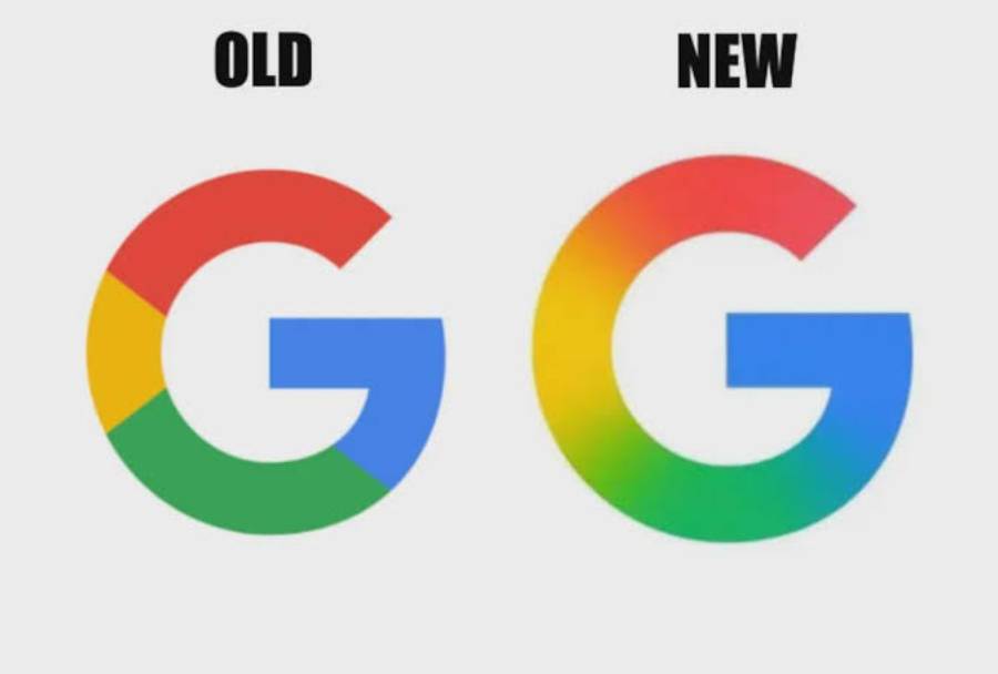
In 2015, Google swapped its old serif logo for the clean, geometric sans-serif logo it uses today. It was actually one of the company’s biggest visual overhauls in years, built to scale better across phones, watches, and tiny app icons. Yet because the colors stayed the same and the word still just said “Google,” most people never registered that anything had changed.
2. Verizon
For years, Verizon’s logo featured a small red checkmark tucked next to the wordmark. In 2015, the company quietly dropped it, leaving just the word “verizon” in lowercase with a red slash through the Z. It was a meaningful shift toward a cleaner, more modern identity, but since the core wordmark barely changed, most customers kept walking into stores without ever noticing.
3. AT&T
AT&T’s globe icon has been redesigned several times over the decades, and one of its more recent updates simplified the sphere with more minimal blue stripes. The overall shape stayed familiar enough that the change barely registered outside of design circles. It’s a good example of a legacy brand protecting its most recognizable asset while still modernizing it.
4. Walmart
Walmart’s yellow “spark” burst first appeared in 2008, replacing the star that had sat next to the company name for years. The wordmark itself also shifted from all caps to lowercase. It’s a textbook example of evolving a logo without losing the instant recognition that took decades to build.
5. eBay
eBay has updated its multicolor logo more than once, each time flattening the letters, adjusting the color palette slightly, and cleaning up the overlap between letters. Since the four-color scheme and lowercase lettering stayed intact, longtime users rarely noticed the differences between versions.
Trending on Wealth Gang

6. Mozilla
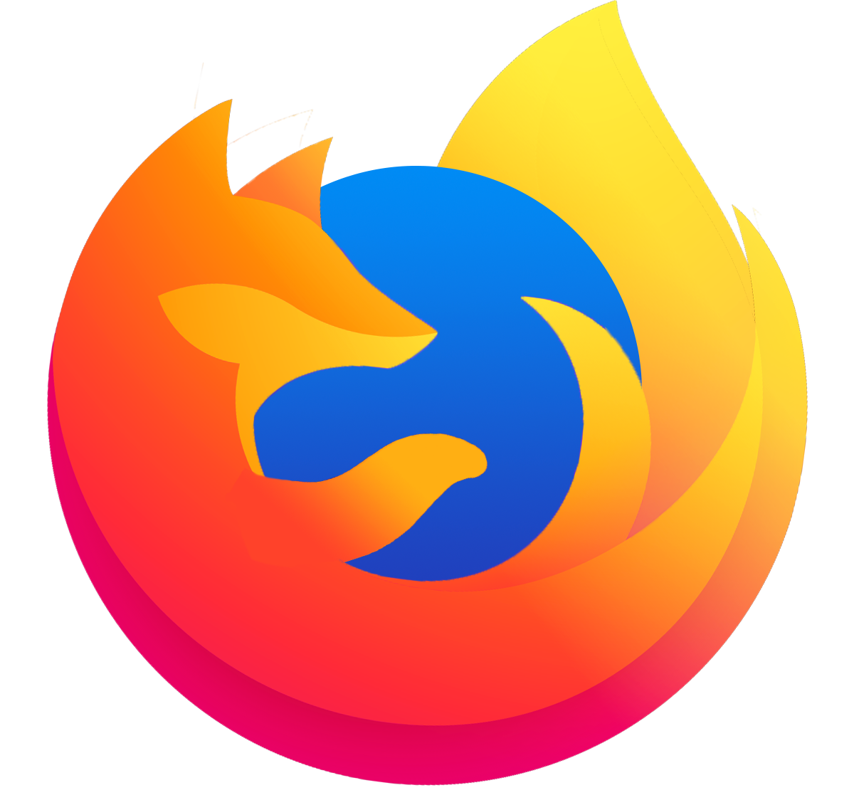
Firefox’s parent company Mozilla trimmed down its logo to remove extra visual clutter, simplifying lines and spacing to look sharper on modern screens. It’s a quiet reminder that most people know Mozilla for the little animal, not the exact geometry of the design.
7. Flipboard

The news app Flipboard shifted to an all-caps typeface, simplified its symbol down to a single color, and brightened its red tone. Regular users of the app may have caught the shift.
8. Celine
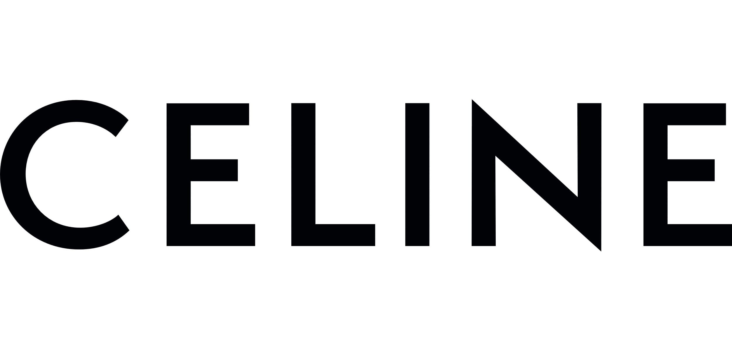
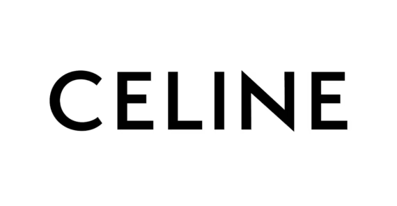
When French fashion house Celine updated its logo, it actually removed the accent mark from the “É,” moving closer to the brand’s original 1960s design. The new lettering borrowed from 1930s modernist typography. Fashion insiders noticed the historical callback immediately, but for the average shopper, the wordmark still just read “Celine”.
Sign up for our newsletter
9. Calvin Klein

Calvin Klein moved away from its familiar all-caps “CK” branding toward a design the company described as a return to its original spirit. It was a deliberate, quiet move rather than a loud reinvention.
10. Uber

Uber’s logo has changed dramatically more than once, but one of its quieter updates involved a custom typeface that moved away from all-uppercase lettering. The overall black-and-white simplicity stayed consistent, so while designers noticed the new letterforms, most riders were too busy to notice the wordmark had been refined.
11. Pizza Hut
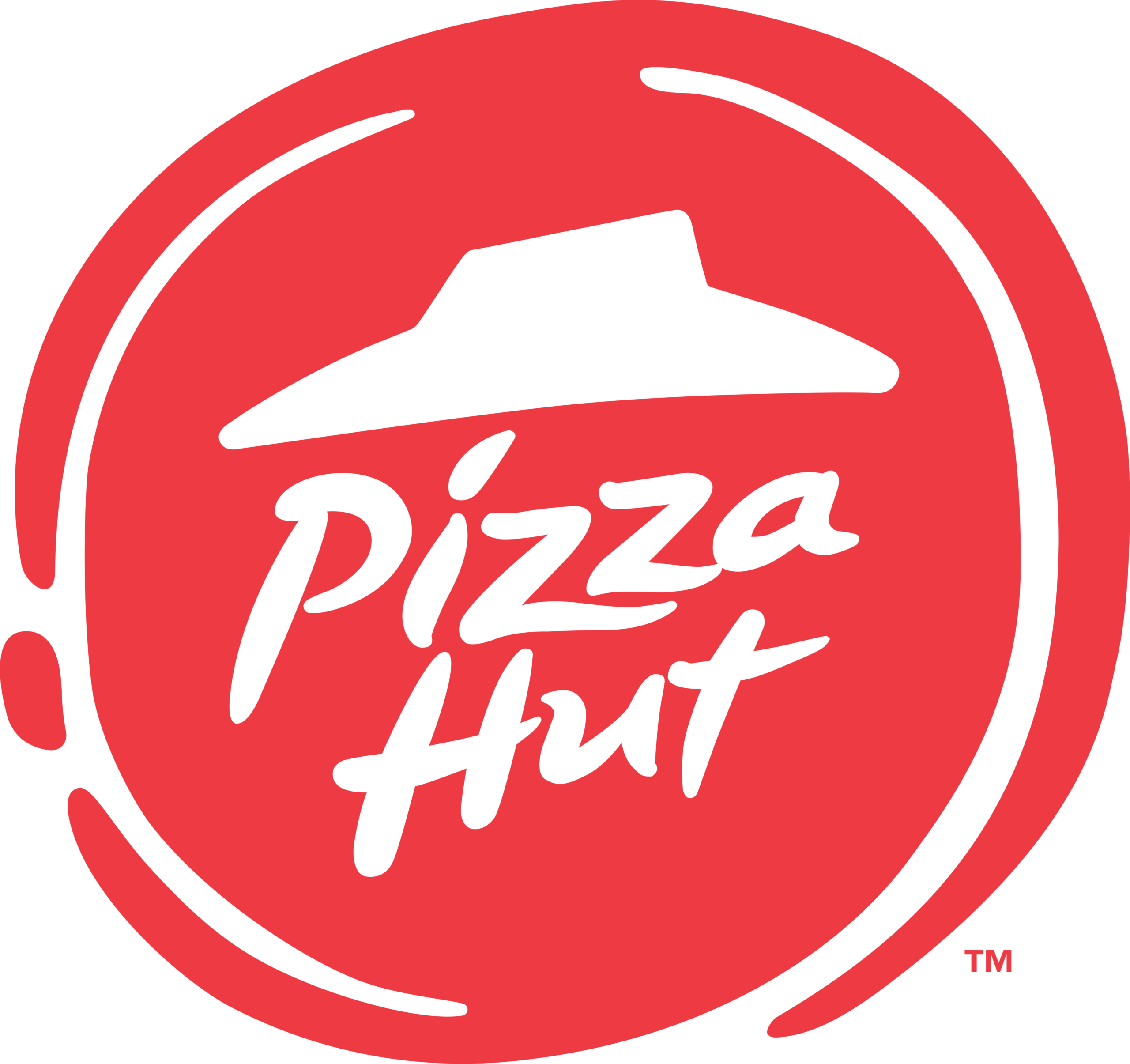
Pizza Hut’s logo used to feature a small red roof sitting above the name, a nod to the chain’s original restaurant shape. At one point, the company dropped the roof entirely in favor of a simplified red circle design.
12. Dunkin’

In 2019, Dunkin’ Donuts officially shortened its name to just “Dunkin’,” dropping “Donuts” from its signage and packaging nationwide. The pink and orange color palette, the script lettering, and the overall vibe of the brand stayed exactly the same.
More related notes:
Check out 18 Classic American Brands That Quietly Became Collectors’ Favorites for a look at the household names now fetching serious money at auctions and antique shops. For a trip down memory lane, 15 Department Store Brands Every Family Knew That Completely Disappeared revisits the retailers that once anchored malls and Main Streets before vanishing for good. And for the flip side of that story, 15 Brands That Unknowingly Went Bankrupt and Reinvented Themselves shows how names like Apple, Lego, and Marvel hit rock bottom and came back stronger than ever.